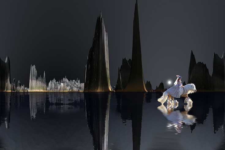
Photoshop means there are no limits. You can embellish reality, create fantasy, and make your dreams come true . . . at least visually. And all of this can be done simply by combining images. The key is to put photos together that work. For example, you have to match the light. In this surrealistic composite, one of the suns on this extraterrestrial landscape is seen in the distance on the right hand side of the image, and therefore I placed another photo in front of that light source that shows backlighting. This makes perfect sense, and therefore the composite is believable -- at least, we can accept it because the lighting is correct. I used Artmatic Voyager to create the landscape, and the Gypsy Vanner horse and rider were photographed in a corral. I used the pen tool in Photoshop to cut them out.

2 Comments
Oct 19, 2015, 1:00:54 PM
Jim - Hi Rosemary, The traditional compositional guideline is to put an object in motion pointed toward the middle of the frame. Doing this means that the horse and rider should be placed on the left as you suggest. Doing the opposite sets up an artistic tension that I find to be an 'edgy' way of composing a photograph. It makes us wonder what is just outside the frame.
Oct 18, 2015, 8:01:36 PM
Rosemary Sheel - Hi, Jim.
Of course when I see your Gypsy Vanner horse, I remember learning to use the pen tool from you. It seems to me that, in these composites, you always place the horse and rider close to the far edge of the scene, while my instinct would be to place it on the opposite 1/3 mark (entering the scene). What is your thinking on this or is it just preference?