Thursday, February 25, 2016 | By: Jim Zuckerman

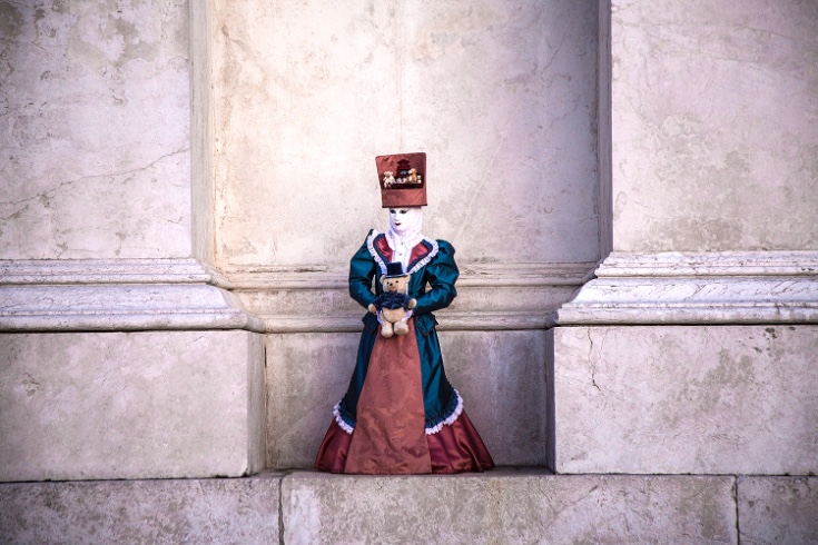
What makes this picture work are the graphic lines of the architecture, the perfectly central position of the Venetian costumed model, the diffused light, and the subtle colors. If any of these elements were missing, this wouldn't be nearly as successful. For example, if the model were a little off-center the symmetry would have been negatively affected. If the building had been busy or didn't have the simple lines and the soft colors, this would not have the visual impact that it does. If this were taken in direct sunlight, also, it would no be as beautiful. I didn't pose this model in this location. I simply recognized a great shot when I saw it. To underscore the symmetry, I stood dead center in front of the model to take the picture.
Leave a comment
0 Comments